Kendall Square
Problem/Challenge:
Thoroughly researched and marketed as the “technological hub of the world”, the Kendall Square Association knew they needed an identity and logo design that would capture it’s uniqueness, and a place on the map.
Solution/Results:
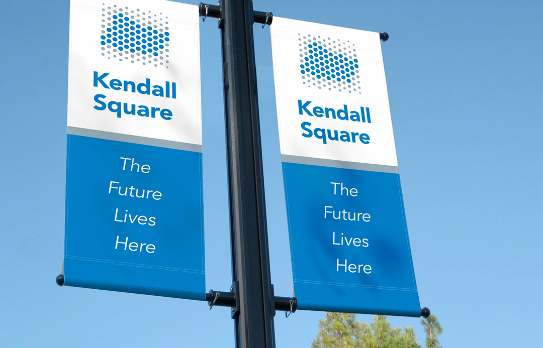
The solution represents an overhead view of Kendall Square and the four streets which define its border. The design of the logo is also representative of a “tech hub” and people being in close proximity with one another. The font chosen was avenir which means “future” in french.
- Logo Design 100%
- Signage Design 100%
- Brand Identity 100%
- Art Direction 100%


%
